Plivo Billing, rebuilt.
I didn’t just redesign the billing page. I designed new features on top of it and ran the project, syncing the billing API team, product, and engineering while the pricing model changed under us.
Problem
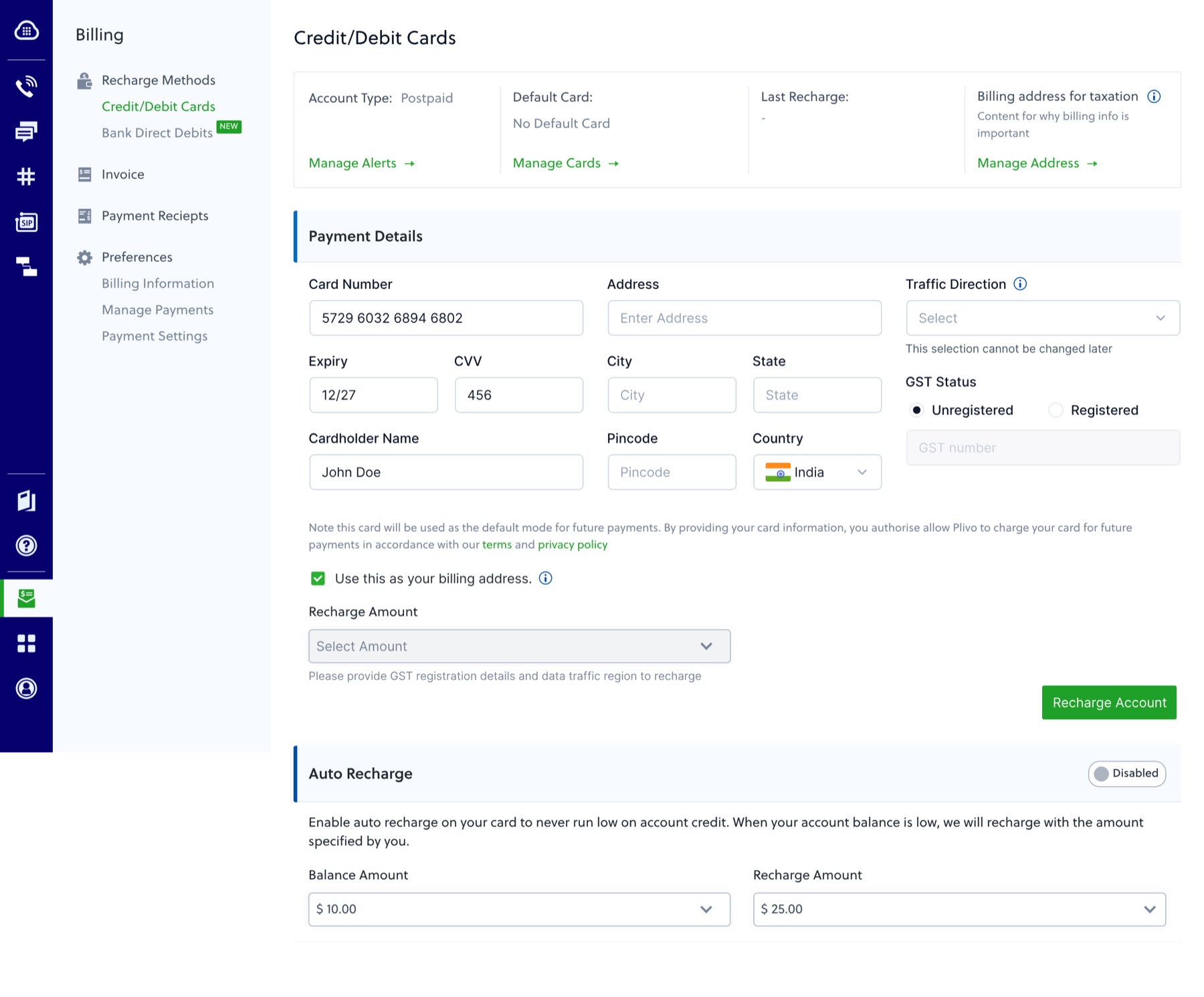
Billing ran on a prepaid balance the customer couldn’t see. The screen that should have shown it opened straight onto a card and tax form instead.
Approach
Read the whole existing section before drawing anything, then gave it one structure and built the features it was missing: autopay for India, bank transfer for the US, plans, seats.
Outcome
The redesign and India autopay shipped. Plans and downgrades were designed and set aside when pricing kept changing. No numbers here that aren’t real.
Most weeks were half design, half keeping three teams on one plan.
To design billing well I needed things that lived with other teams, so I ran this as much as I designed it.
Billing API team
We matched what the new screens needed against what the API could return, and when.
Head of product
Owned real pricing, plan-based and custom, which I needed before I could show a customer anything.
Billing engineering
Knew the constraints: payment regulations, mandate rules, and what could ship without a backend rebuild.
Pricing moved more than once mid-project. Screens built for one set of tiers had to hold up under the next set, so the structure had to survive the numbers changing, not just fit the numbers I had that week.
A card form standing in for a billing page.
Billing runs on a prepaid balance. Every call, message, and phone number spends it down, and service stops at zero. The old screen didn’t show the balance. It opened straight onto a card and tax form, built one feature at a time, owned by no one.
Nowhere to see your money
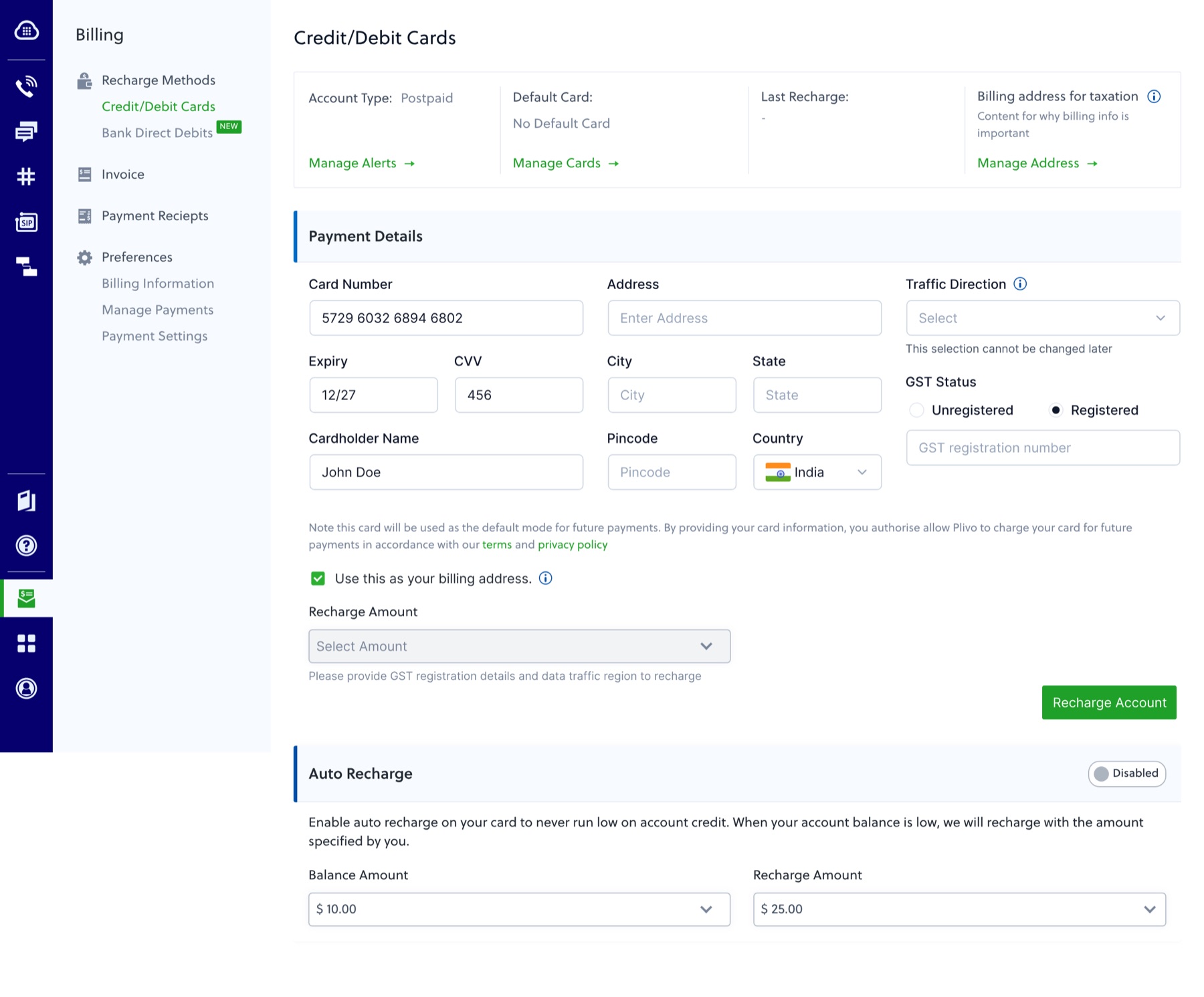
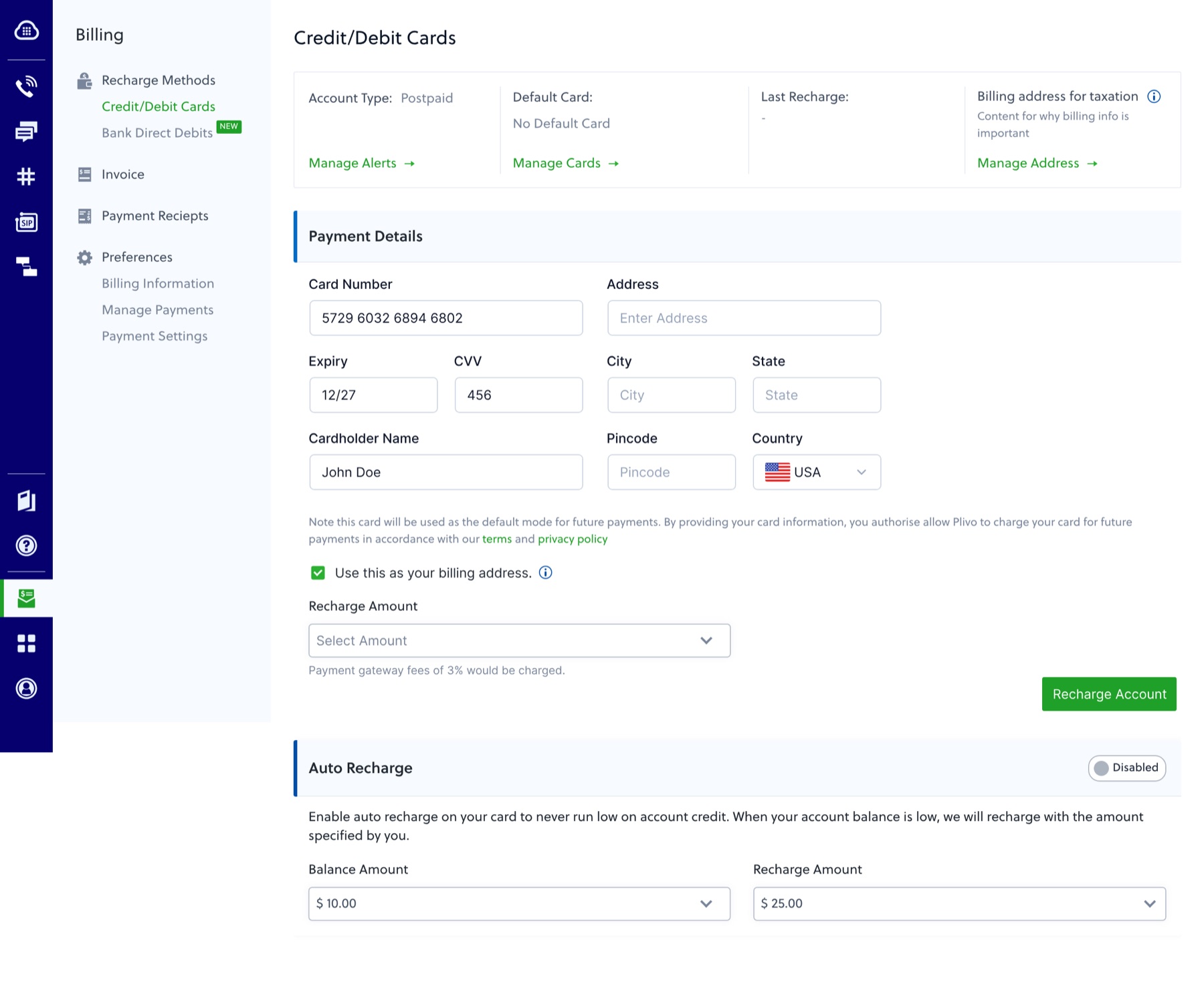
No balance, no usage, no history, just a card form and a few “Manage” links.
Recharge was blocked
You couldn’t add money until you filled in GST details and a Traffic Direction setting that had nothing to do with paying.
Mixed and unclear
“Postpaid” sat next to “Last Recharge.” A field said it “cannot be changed later” with no reason given.
No autopay in India
One disabled toggle at the bottom. Indian customers topped up by hand, every time. The reason why is further down this page.
One structure: Overview, Invoices, Receipts, Settings.
I read the whole existing section before drawing anything: every screen, every setting, who used it. That gave me the map: keep, move, cut, and where customers got stuck.
One screen to know where you stand
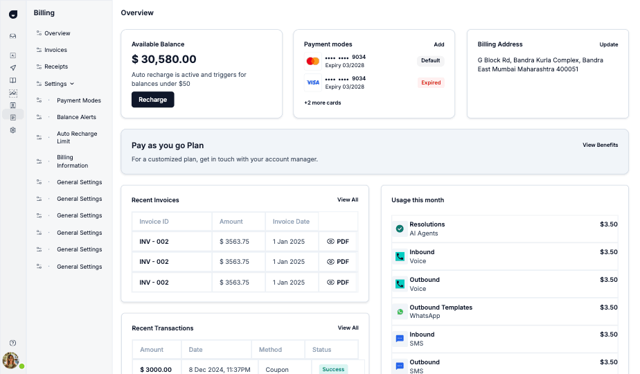
Balance, payment mode, and billing address in one header. Plan, invoices, usage, and transactions below it.
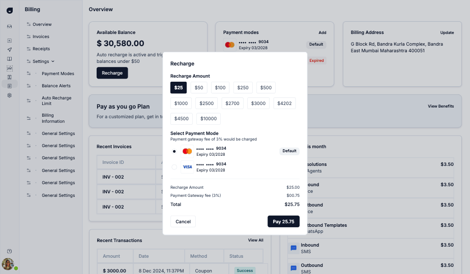
Recharge shows the fee first
Preset amounts, pick a mode, see the gateway fee before you pay.
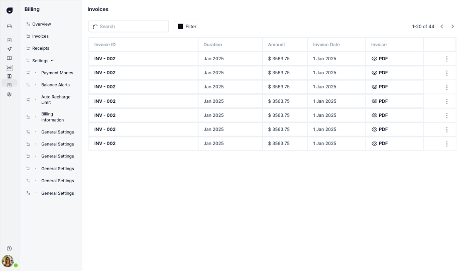
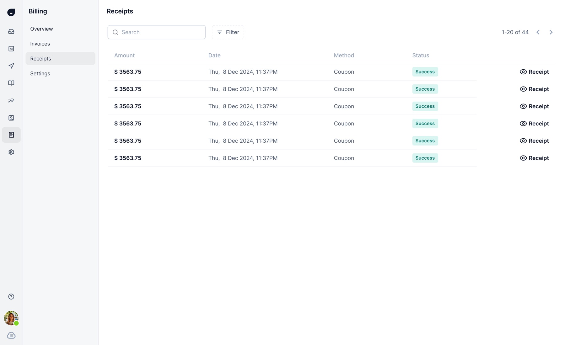
Invoices and receipts, kept separate
What you owe and what you’ve paid: two lists, both searchable and downloadable.
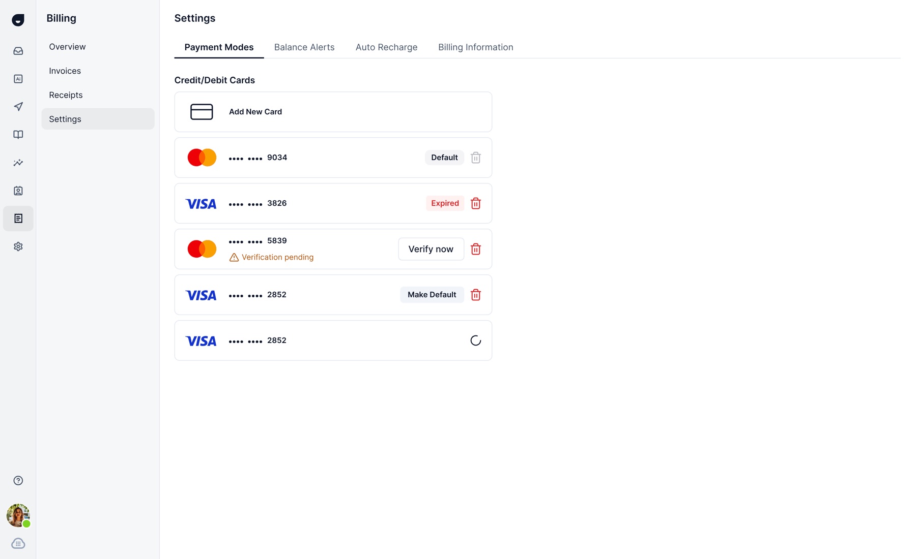
Cards and tax details where they belong
Card list with default, expired, and expiring-soon states. Adding a card steps through card, address, then GST status.
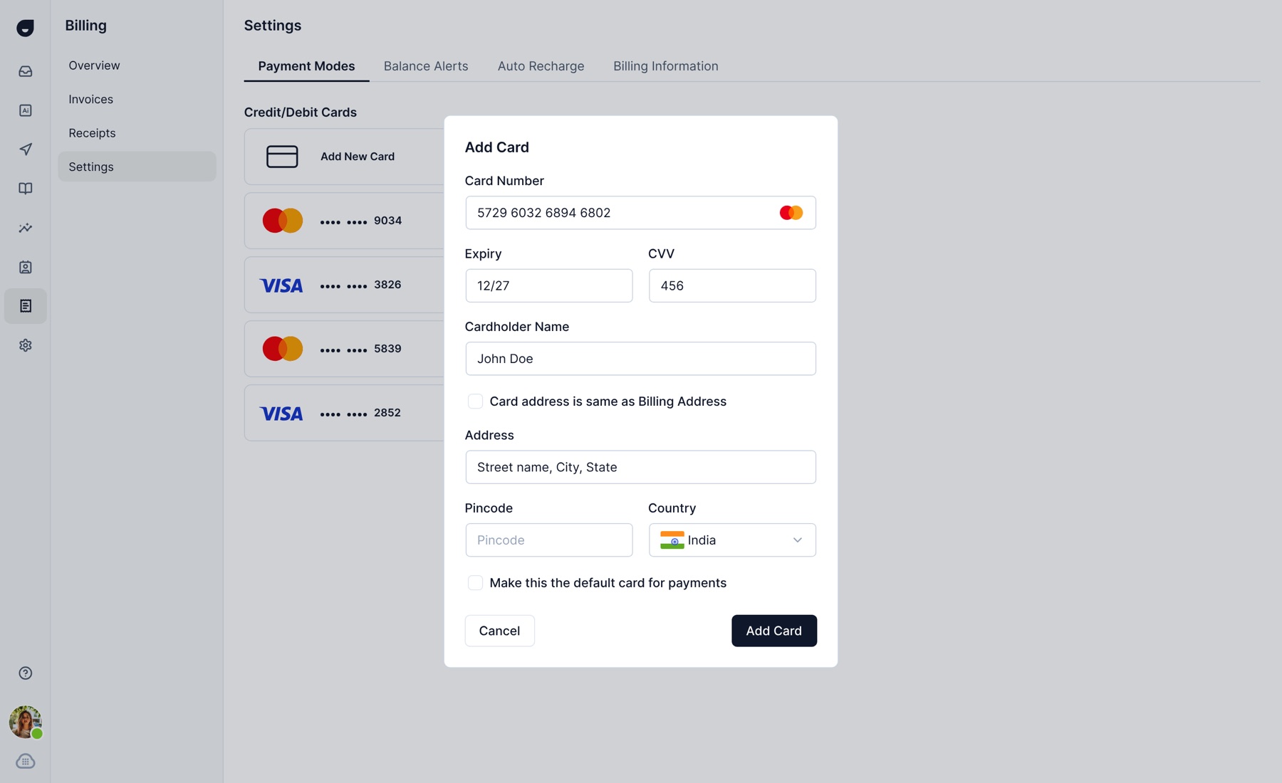
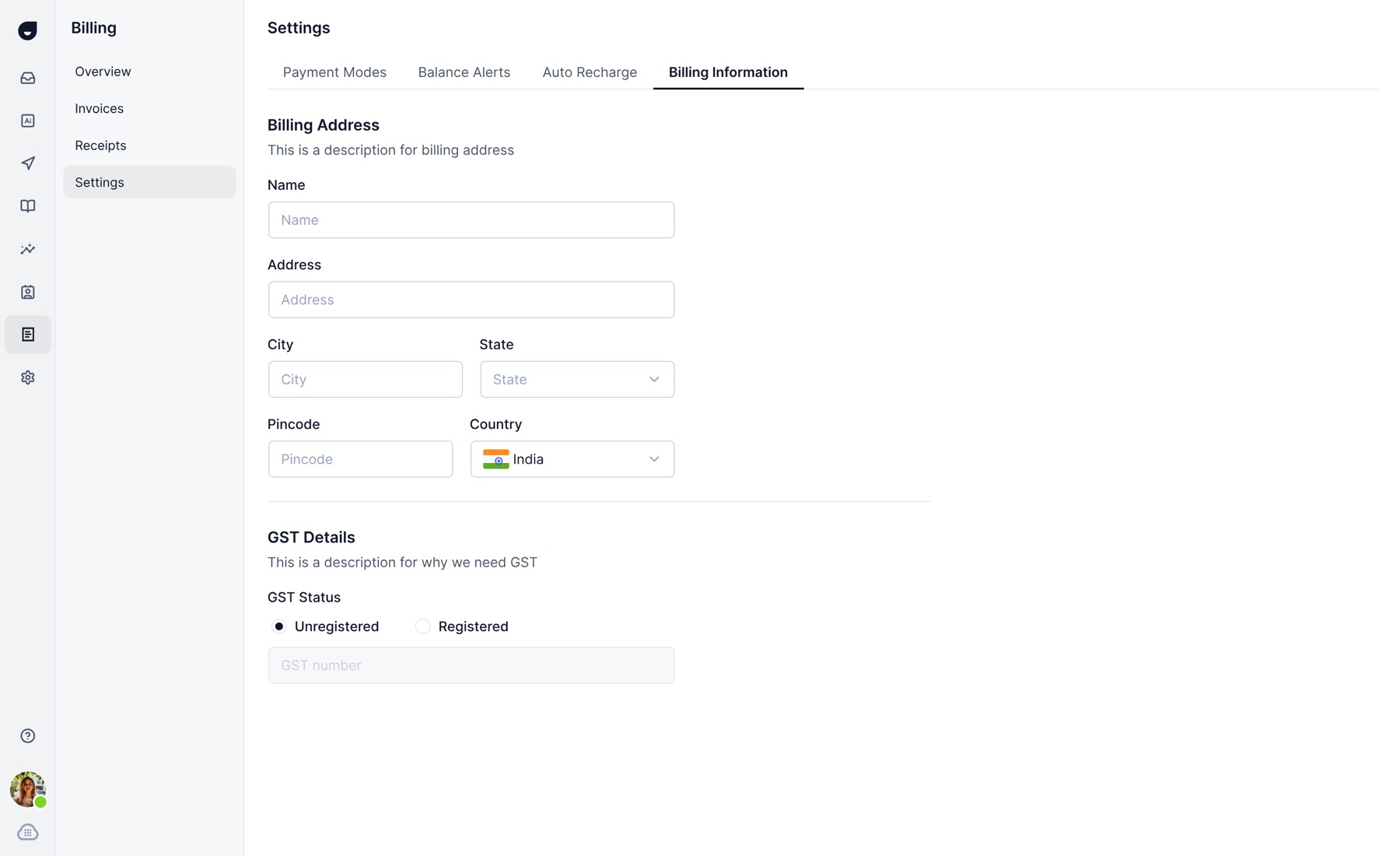
Redesigning the old screens was half the brief.
The other half was features that didn’t exist yet: plans, autopay for India, bank transfer for the US, and seat-level billing for teams.
Plans, upgrades, downgrades.
Billing was meant to launch with paid tiers, each with its own limits: pay as you go, Professional, Team, Enterprise, custom. I built the plans page and the upgrade, downgrade, and deactivation flows: upgrade shows the new price and the part-month charge before anything is billed, downgrade shows what you keep and the date it takes effect, down to the free tier.
The tiers moved more than once while I designed around them. We didn’t go through with this one: pricing kept changing, and it got descoped before it shipped. It’s here because it was real work, not because it’s live.
Upgrade with the cost shown first
New price, part-month charge, and the payment step, all before anything is billed.
Downgrade without guesswork
What you keep, what you lose, and when it takes effect, including the path down to deactivation.
Autopay for India.
Auto recharge didn’t exist for Indian customers, and that wasn’t a design gap so much as a regulatory one.
is the most a recurring mandate can auto-debit without extra authentication, under RBI’s e-mandate rules for digital payments. Above that line, the customer has to re-authenticate every time, which defeats the point of “auto.” The design had to fit inside that ceiling instead of working around it.
The constraint
A mandate above ₹15,000 per transaction needs authentication on every debit, so a single large mandate isn’t really “auto” anymore.
The design response
Recommend mandate size and frequency by default, and split higher spenders into several smaller mandates instead of one large one.
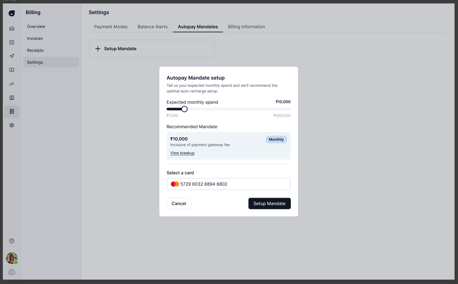
Size the mandate, don’t guess it
One slider for spend. We recommend the amount and frequency, and the recommendation stays under ₹15,000 by default.
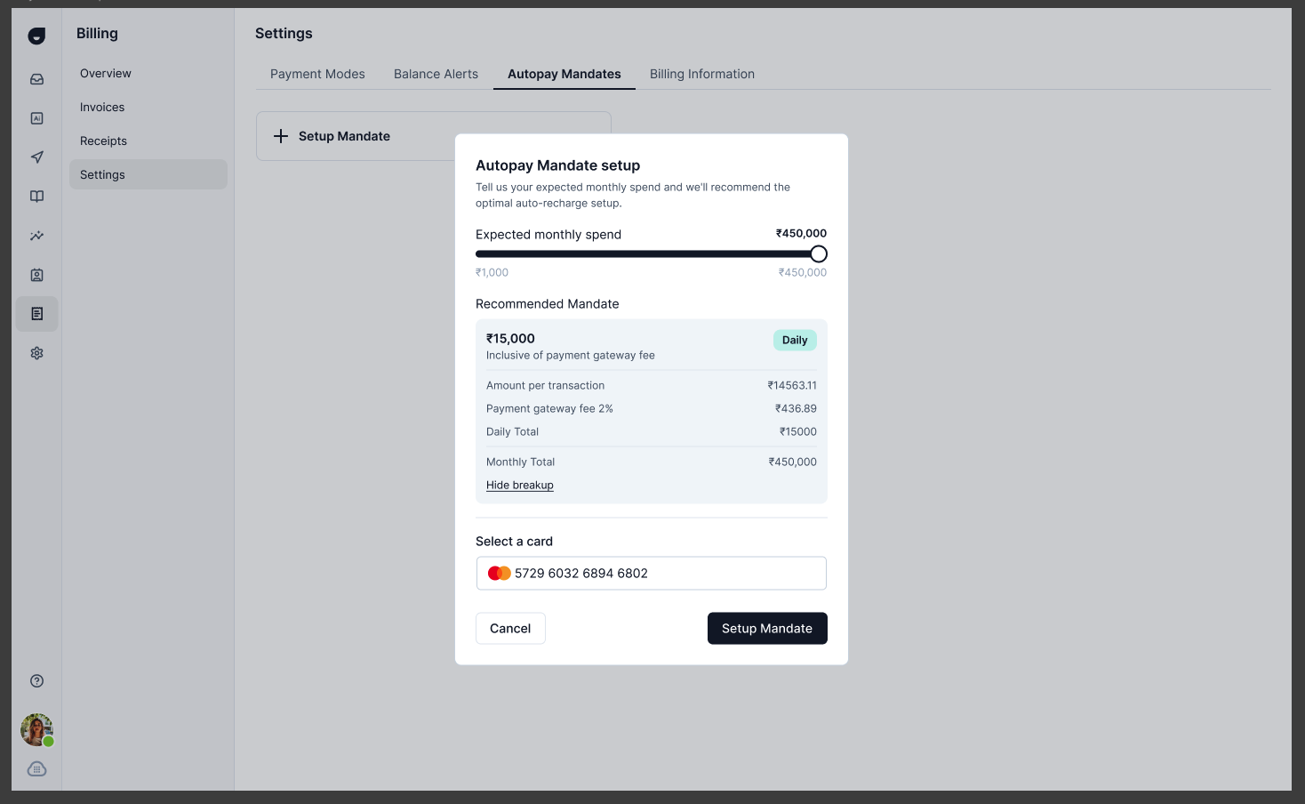
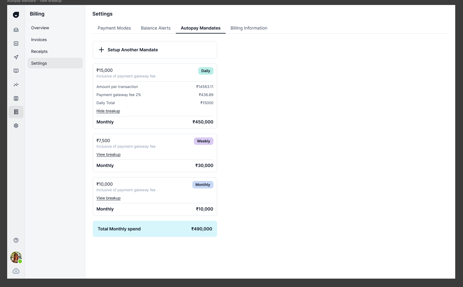
Every rupee of the debit, explained
Per-transaction amount, gateway fee, and daily and monthly totals, all shown before you confirm.
Several mandates instead of one large one
A customer spending more than ₹15,000 a month gets multiple smaller mandates rather than one needing authentication on every charge, plus a running total and a “last payment failed, re-authenticate” path.
A bank transfer option for the US.
Card fees add up at high spend. Bank direct debit and bank transfer were new for US customers, built as part of this project.
Add a bank account and verify it
Account and routing details, then a small test deposit to confirm. Standard bank verification, done in the product instead of over email.
A virtual account for transfers
Bank details for wires and ACH, with the timing spelled out: same day for wires, one to three days for ACH.
Debits on a schedule
A day of the month and an amount, so the balance tops up without a card.
Seat management.
Seat changes had to not surprise the invoice. Add a seat mid-cycle and you’re charged pro-rata for the rest of that cycle. Remove one and there’s no refund. Both rules show before you confirm, and the confirm step sits on the money action instead of a generic “Save.”
Billing went from a pile of screens to one structure with a point of view.
Indian customers got autopay for the first time, built around a real regulatory ceiling instead of ignoring it. US customers got a way to pay that isn’t a card. Any customer can see the rate behind their usage instead of taking the invoice on faith.
Plans and seat-level billing were designed in the same pass. Plans didn’t ship. Seats did.